CSS Flexbox
What is CSS Flexbox?
Flexbox is a CSS layout module called “Flexible Box Module” which is a one-dimensional layout module that allows users to arrange and organize their webpages horizontally or vertically. Flexbox simplified the creation of responsive layouts through aligning flex items within a flex container and filling the extra space available or shrink the size of content if it is overflowing.
Flexbox Basics
CSS flexbox is one-dimensional, that is, flexbox deals with a layout in one dimension at a time; either as a row or as a column unlike the two-dimensional model of CSS Grid Layout, which controls columns and rows together.
When dealing with flexbox you need consider two axes; the main axis and the cross axis as illustrated below. The main axis is defined by the flex-direction property, and the cross axis runs perpendicular to it.
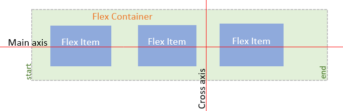
- Flex Container – is used as a container for the flex-items. To make the container flexible we set the display property as flex.
- Main Axis – The main axis is used as a primary axis for the flex-container to align the flex-items. It is set using the flex-direction property.
- Cross Axis – It is always perpendicular to the main axis.
If your flex-direction (main axis) is set to row or row-reverse the cross axis runs down the columns and if your main axis is column or column-reverse then the cross axis runs along the rows.
CSS Flexbox Properties
The CSS flexbox layout module has a number of properties. Some of these properties are applied to the parent flex container while others are applied to the flex items.
Properties for the Parent (flex container)
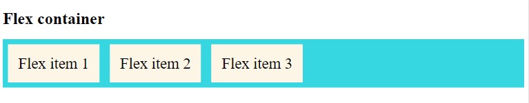
CSS display property
CSS display property defines the container for the HTML element. It helps in making the container flexible.
Syntax:
display: flex;
To make the container display property is set to flex.
Example:
I’ll use the example code below to demonstrate the display property and other properties for the flex container and flex items.
<!DOCTYPE html>
<html>
<head>
<style>
.flex-container {
  display: flex;
  background-color: #37D7E1;
}

.flex-container > div {
  background-color: #fdf5e6;
  margin: 10px;
  padding: 20px;
  font-size: 30px;
}
</style>
</head>
<body>

<h1>Example of flex container</h1>

<div class="flex-container">
  <div>Flex item 1 </div>
  <div>Flex item 2 </div>
  <div>Flex item 3 </div>
</div>

<p>The flex-container should have a parent element with the <em>display</em> property set as <em>flex</em>.</p>
</body>
</html>
Output:
CSS flex-direction property
CSS flex-direction property is used to set the orientation and direction of the flex items.
Syntax:
flex-direction:row | row-reverse | column | column-reverse;;
Example:
CSS code
<style>
.flex-container {
  display: flex;
  flex-direction: column-reverse;
  background-color: #bc8f8f;
}

.flex-container > div {
  background-color: #fdf5e6;
  margin: 10px;
  padding: 20px;
  font-size: 30px;
}
</style>
HTML Code
<h1>Example of flex container</h1>

<div class="flex-container">
  <div>flex item 1</div>
  <div>flex item 2</div>
  <div>flex item 3</div>
</div
Output:
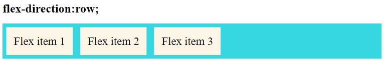
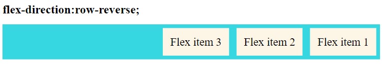
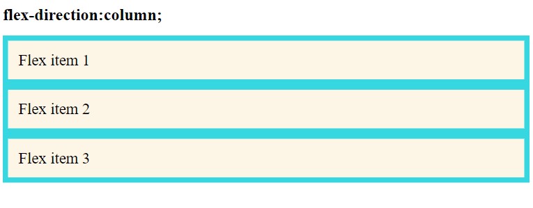
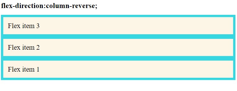
The illustrations above show how flex-items are arranged within the flex-container using different values of flex-direction property
row(default): flex-items are displayed horizontally, as a rowrow-reverse: same as row, but in reverse ordercolumn: flex-items are displayed vertically, as a columncolumn-reverse: same ascolumnbut in reverse order
CSS flex-wrap property
The flex-wrap property defines whether flex items in a row should wrap when the window size changes or not. By default, flex items will all try to fit onto one line.
Syntax:
flex-wrap:nowrap | wrap | wrap-reverse;;
Example:
<style>
.flex-container {
  display: flex;
  flex-wrap: wrap;
  background-color: #bc8f8f;
}

.flex-container > div {
  background-color: #fdf5e6;
  margin: 10px;
  padding: 20px;
  font-size: 30px;
}
</style>
<div class="flex-container">
<div>flex item 1</div>
<div>flex item 2</div>
<div>flex item 3</div>
<div>flex item 4</div>
<div>flex item 5</div>
<div>flex item 6</div>
<div>flex item 7</div>
</div>Output:

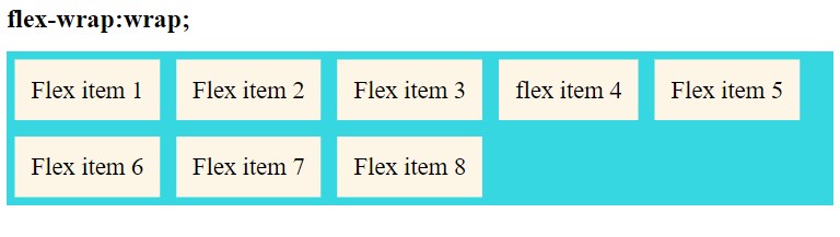
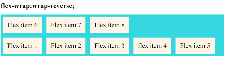
The illustrations above show how flex-items are arranged within the flex-container using different values of flex-wrap property
nowrap(default): all flex items will be on one linewrap: flex items will wrap onto multiple lines, from top to bottom.wrap-reverse: flex items will wrap onto multiple lines from bottom to top.
CSS justify-content property
Justify-content allows you to align flex-items along the main horizontal axis when the items do not use all available space on this axis.
Syntax:
justify-content:flex-start | flex-end | center | space-between | space-around | space-evenly | start | end | left | right;
Example:
.flex-container {
  display: flex;
  flex-flow: row wrap;
  justify-content: space-between;
  background-color: #37D7E1;
}

.flex-container > div {
  background-color: #fdf5e6;
  margin: 10px;
  padding: 20px;
  font-size: 30px;
}
Output:
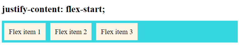
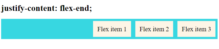
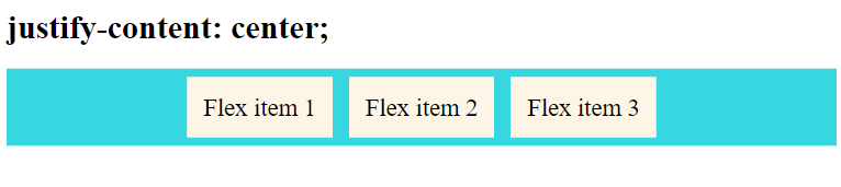
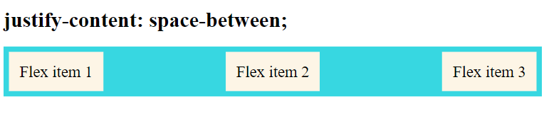
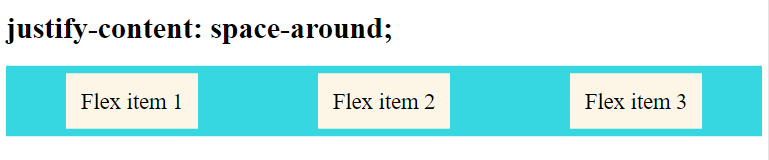
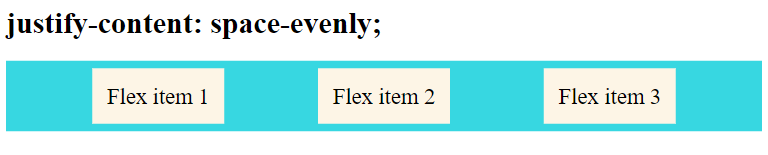
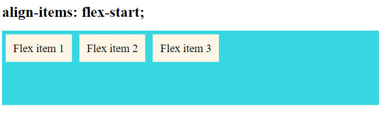
From the illustrations above, you can observe the various values for the justify-content property and how they affect the alignment of flex-items.
flex-start(default): items are packed toward the start of the flex-direction.flex-end: items are packed toward the end of the flex-direction.start: items are packed toward the start of thewriting-modedirection.end: items are packed toward the end of thewriting-modedirection.left: items are packed toward left edge of the container, unless that doesn’t make sense with theflex-direction, then it behaves likestart.right: items are packed toward right edge of the container, unless that doesn’t make sense with theflex-direction, then it behaves likestart.center: items are centered along the linespace-between: items are evenly distributed in the line; first item is on the start line, last item on the end linespace-around: items are evenly distributed in the line with equal space around them. Note that visually the spaces aren’t equal, since all the items have equal space on both sides. The first item will have one unit of space against the container edge, but two units of space between the next item because that next item has its own spacing that applies.space-evenly: items are distributed so that the spacing between any two items (and the space to the edges) is equal.
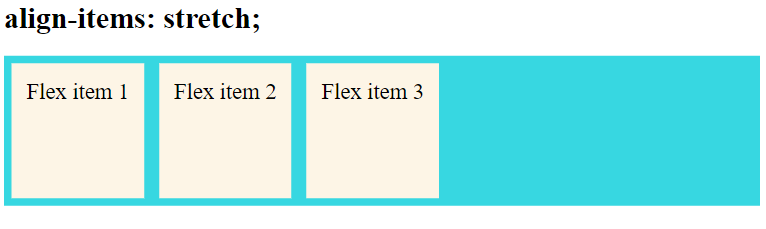
CSS align-items property
Align items are used to align flex-items along the cross-axis. It takes the following values: – start, end, stretch, center.
Syntax:
align-items:stretch | flex-start | flex-end | center | baseline | first baseline | last baseline | start | end ;
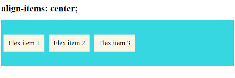
The value of align-items is set to center which means the items are packed around the center. The basic keywords used for align-items are: normal and stretch.
Example:
.flex-container {
  display: flex;
  flex-flow: row wrap;
  align-items: flex-start;
  background-color: #37D7E1;
}

.flex-container > div {
  background-color: #fdf5e6;
  margin: 10px;
  padding: 20px;
  font-size: 30px;
}
Output:

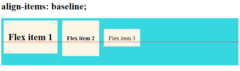
The baseline value aligns the flex items such as their baselines align. In the example below I have used different font-size to demonstrate that the items gets aligned by the text baseline:
<h1>align-items: baseline;</h1>
<div class="flex-container">
    <div><h1>Flex item 1</h1> </div>
    <div><h5>Flex item 2</h5> </div>
    <div><small>Flex item 3</small> </div>
  </div>
.flex-container {
display: flex;
height: 200px;
align-items: baseline;
background-color: #37D7E1;
}Output:
In the above example, the value of align-items is set as flex-start where the items pack from the start.
Stretch is the default value that stretches the flex-items to fill the container.
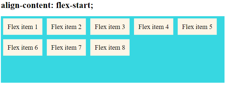
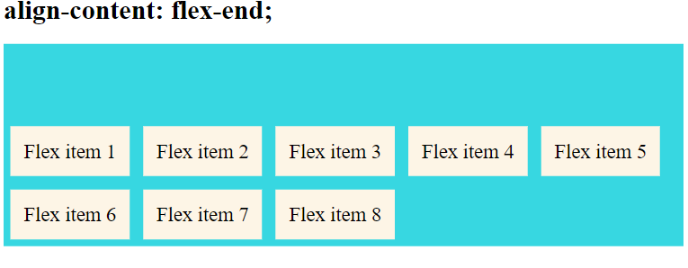
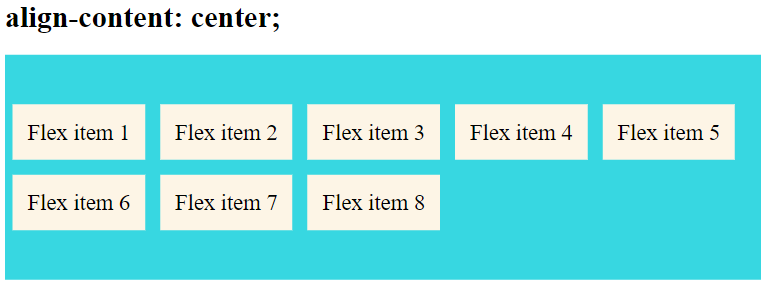
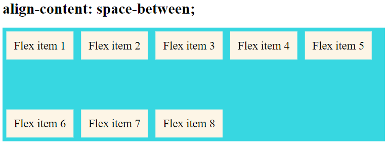
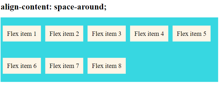
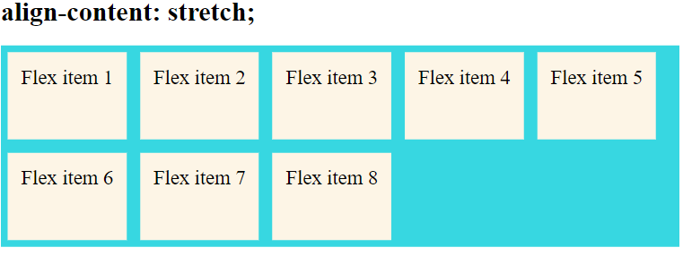
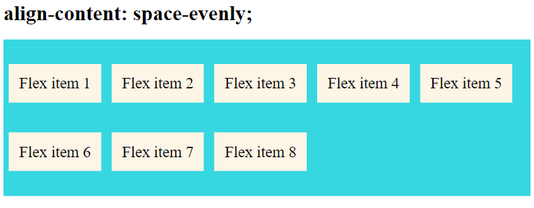
CSS align-content property
Align-content is used to modify the behavior of the flex-wrap property. It is similar to align-items, but instead of aligning flex items, it aligns flex lines along the Cross Axis. It works similarly to justify-content.
There must be multiple lines of items for this property to have any effect.
Syntax:
align-content:flex-start | flex-end | center | space-between | space-around | space-evenly | stretch | start | end | baseline | first baseline | last baseline;
This property only takes effect on multi-line flexible containers, where flex-wrap is set to either wrap or wrap-reverse. A single-line flexible container where flex-wrap is set to its default value, no-wrap will not reflect align-content.
Example
<div class="flex-container">
    <div>Flex item 1</div>
    <div>Flex item 2</div>
    <div>Flex item 3</div>
    <div>Flex item 4 </div>
    <div>Flex item 5</div>
    <div>Flex item 6</div>
    <div>Flex item 7</div>
    <div>Flex item 8</div>
  </div>
.flex-container {
display: flex;
height: 300px;
flex-wrap: wrap;
align-content: stretch;
background-color: #37D7E1;
}Output:
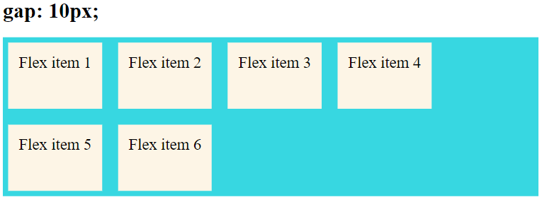
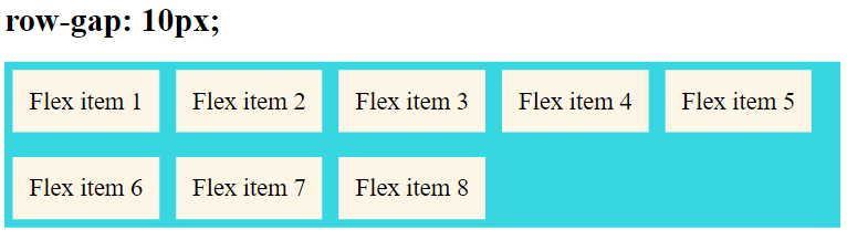
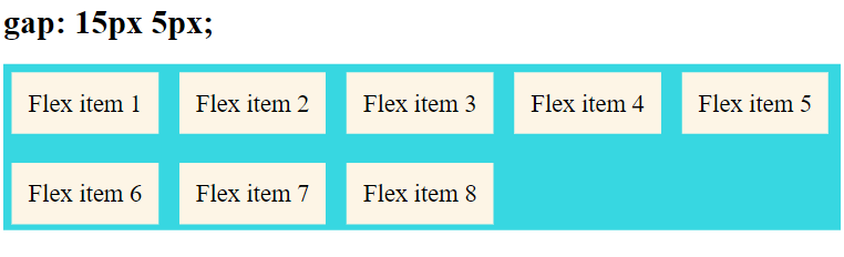
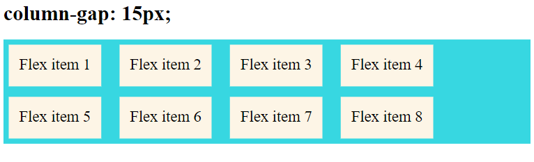
CSS gap, row-gap and column-gap properties
The gap property is a shorthand for row-gap and column-gap properties that is used to set the gap between rows and columns.
Syntax:
gap:row-gap column-gap;
gap takes row value first then column value.
The gap property explicitly controls the space between flex items, that is, the spacing is applied only between items not on the outer edges.
Example:
In the following example, the value of row gap is set as 15px and column gap is set as 5px.
.flex-container {
  display: flex;
  flex-flow: row wrap;
  gap: 15px 5px;
  background-color: #37D7E1;
}
Output:
The illustrations below show the various outputs for different values for gap, row-gap and column-gap properties
Properties for the Children (flex items)
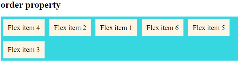
CSS order property
CSS order property specifies the order of a flexible item relative to the rest of the flexible items inside the same container. The order of the flex-item is assigned by a number as shown in the syntax.
Syntax:
order:number|initial|inherit;
Example:
<div class="flex-container">
  <div style = "order: 2">flex item 1</div>
  <div style = "order: 1">flex item 2</div>
  <div style = "order: 4">flex item 3</div>
  <div style = "order: 6">flex item 4</div>
  <div style = "order: 5">flex item 5</div>
  <div style = "order: 3">flex item 6</div>
</div>
Output:
CSS flex-grow property
Flex-grow specifies how much the item will grow relative to the rest of the flexible items inside the same container. It grows its size according to the width of the flex-container.
Syntax:
flex-grow:number|initial|inherit;
The value of flex-grow is set as 2 that means the size of the flex item will increase by 2 based on the width of the flex-container.
Example:
<div class="flex-container">
    <div style="flex-grow: 1;">Flex item 1</div>
    <div style="flex-grow: 4;">Flex item 2</div>
    <div style="flex-grow: 1;">Flex item 3</div>
  </div>
Output:
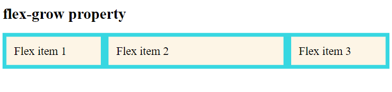
From the output above, you can observe that the size of item 2 is larger compared to the other items.
CSS flex-shrink property
Flex-shrink property specifies how the item will shrink relative to the rest of the flexible items inside the same container. It is the opposite of the flex-grow property. The default value of CSS flex-shrink is 1.
Syntax:
flex-shrink:number|initial|inherit;
Example:
<h1>flex-shrink property</h1>
  <div class="flex-container">
    <div>1</div>
    <div style="flex-shrink: 2;">2</div>
    <div>3</div>
    <div>4</div>
    <div style="flex-shrink: 4;">5</div>
    <div>6</div>
    <div>7</div>
    <div>8</div>
  </div>
.flex-container > div {
background-color: #fdf5e6;
width: 100px;
margin: 10px;
padding: 20px;
font-size: 30px;
}You have to remove the flex wrap property to make flex-shrink work.
Output:
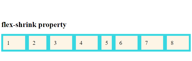
The value of flex-shrink is added to the flex-item 5 where the flex item’s size shrinks.
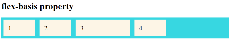
CSS flex-basis property
Flex-basis is used to define the initial size of a flex-item.
Syntax:
flex-basis:number|auto|initial|inherit;
We can set the size of flex-item using flex-basis property.
Example:
In this example, the initial size of flex item 3 is set as 200px.
<h1>flex-basis property</h1>
<div class="flex-container">
<div>1</div>
<div>2</div>
<div style="flex-basis:200px">3</div>
<div>4</div>
</div>Output:
CSS flex property
The flex property is a shorthand for flex-grow, flex-shrink and flex-basis combined. It is recommended to use the flex property instead of setting the individual properties since the shorthand sets the other values intelligently.
The order will be flex-grow, flex-shrink, and flex-basis as shown in the syntax below.
Syntax:
flex:none | [ <'flex-grow'> <'flex-shrink'>? || <'flex-basis'> ]
The second and third parameters (flex-shrink and flex-basis) are optional. The default is 0 1 auto, but if you set it with a single number value, like flex: 5;, that changes the flex-basis to 0%, so it’s like setting flex-grow: 5; flex-shrink: 1; flex-basis: 0%;.
Example:
In this example I have set all the three values using flex to the flex item 1.
<div class="flex-container">
<div>1</div>
<div>2</div>
<div style="flex: 0 0 200px">3</div>
<div>4</div>
</div>Output:
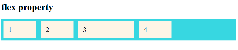
From the output, the flex property is applied to flex item 3 with the values: flex-grow as 0, flex-shrink as 0, and flex-basis as 200px.
CSS align-self property
Normally we use the align-items property to align flex-items in the flex-container. However, the align-self property is used to override the default alignment of an individual flex item as specified by align-items property.
In short, the align-self property overrides the flexible container’s align-items property.
Syntax:
align-self: auto|stretch|center|flex-start|flex-end|baseline|initial|inherit;
Example:
CSS Code
.flex-container {
display: flex;
height: 200px;
background-color: #37D7E1;
}
.flex-container > div {
      background-color: #fdf5e6;
      width: 100px;
      margin: 10px;
      padding: 20px;
      font-size: 30px;
}HTML Code
<h1>align-self property</h1>

  <div class="flex-container">
    <div style="align-self: auto;">1</div>
    <div style="align-self: flex-start">2</div>
    <div style="align-self: flex-end">3</div>
    <div style="align-self: stretch;">4</div>
    <div style="align-self: center;">5</div>
    <div style="align-self: baseline;">5</div>
  </div>
Output:
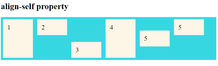
From the output above, you can see that the alignment of the flex-items depends on the value of the align-self property.
CSS ShortHand Flexbox Properties
We have already seen the CSS Flex property which is a shorthand property. Now, let’s see a few other shorthand properties.
CSS flex-flow property
CSS flex-flow is a shorthand property for setting both the flex-direction and flex-wrap properties. It takes flex-direction value first then flex-wrap property.
Syntax:
flex-flow: row wrap;
Example:
.flex-container {
  display: flex;
  flex-flow: row wrap;
  background-color: #37D7E1;
}

.flex-container > div {
  background-color: #fdf5e6;
  margin: 10px;
  padding: 20px;
  font-size: 30px;
}
Output:
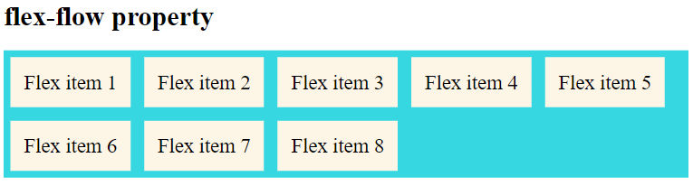
From the above example, we see that the flex items are arranged in the row direction and while resizing the window the flex items wrap.
CSS place-content property
The place-content property in CSS is shorthand for the align-content and justify-content properties, combining them into a single declaration in CSS Grid and Flexbox layouts, where align-content and justify-content are values that align an individual item in the block and inline directions.
Syntax:
place-content: <align-content> <justify-content>;
Below are some examples of how to use place-content property with various align-content and justify-content value pairs
place-content: center start;
place-content: start center;
place-content: end left;
place-content: flex-start center;
place-content: flex-end center;
place-content: space-between space-evenly;
place-content: space-around space-evenly;
place-content: space-evenly stretch;
place-content: stretch space-evenly;
Example:
.flex-container {
  display: flex;
  flex-flow: row wrap;
  place-content: center space-between;
  background-color: #37D7E1;
}

.flex-container > div {
  background-color: #fdf5e6;
  margin: 10px;
  padding: 20px;
  font-size: 30px;
}
Output:
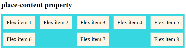
From the above example, I have arranged the flex items using place-content property with values of align-content: center; and justify-content: space-between;