CSS Grid
CSS Grid Layout module provides a two-dimensional layout system that makes it possible to arrange webpages content in rows and columns at the same time. Another popular layout is the CSS Flexbox module which is a one-dimensional layout module which allows users to arrange and organize their webpages either horizontally or vertically.
CSS Grid Layout Module
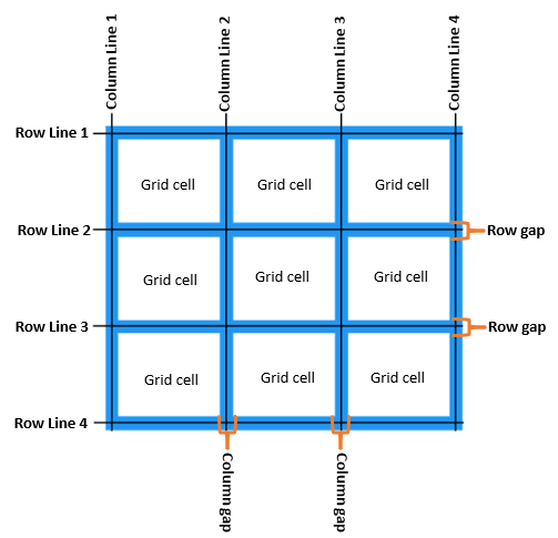
Before looking at the various CSS Grid properties, we need to first understand the basics of Grid layout. A grid can be seen as a series of horizontal and vertical lines used to specify columns and rows as illustrated in the diagram below:
The grid layout is made up of the following features;
- Grid Lines – A grid is made up of lines, which run horizontally and vertically. If your grid has four columns, it will have five column lines including the one after the last column.
- Grid cell – A grid cell is the smallest space on a grid defined by the intersection of row and column tracks. It’s just like a table cell or a cell in a spreadsheet. If you define a grid and don’t place any of the items they will automatically be laid out one item into each defined grid cell.
- Grid area – Several grid cells together. Grid areas are created by causing an item to span over multiple tracks.
- Gaps – A gutter or alley between tracks. For sizing purposes these act like a regular track. You can’t place content into a gap but you can span grid items across it.
- Grid container – The HTML element which has
display: gridapplied, and therefore creates a new grid formatting context for the direct children. - Grid item – A grid item is an item which is a direct child of the grid container.
CSS Properties for the Grid Container
display property
Defines the element as a grid container and establishes a new grid formatting context for its contents.
.container {
display: grid | inline-grid;
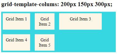
}grid-template-columns property
Defines the number of columns in your grid layout and takes on values as a space-separated-list, where each value defines the width of the respective column.
Note: If the number of grid items is more than the specified number of grid columns, a new row will automatically be added to put the other items in.
I will use the example code below to demonstrate how various grid properties are used.
<!DOCTYPE html>
<html>
<head>
	<meta charset="utf-8">
	<meta name="viewport" content="width=device-width, initial-scale=1">
	<link rel="stylesheet" href="style.css">
	<title>CSS Grid</title>
</head>
<body>
	<h1>grid-template-columns: 1fr 1fr 1fr; </h1>
    <div class="grid-container">
    	<div class="grid-item">Grid Item 1</div>
    	<div class="grid-item">Grid Item 2</div>
    	<div class="grid-item">Grid Item 3</div>
    	<div class="grid-item">Grid Item 4</div>
    	<div class="grid-item">Grid Item 5</div>

    </div>
</body>
</html>
CSS code
h1{
  font-size: 40px;
  font-weight: bold;
}

.grid-container{
	display: grid;
	grid-template-columns: 1fr 1fr 1fr;

	grid-gap: 10px;
	background-color: #37D7E1;
}
.grid-item{
	background-color: #fdf5e6;
	padding: 20px;
	margin: 10px;
	font-size: 30px;
	text-align: center;
}
Output
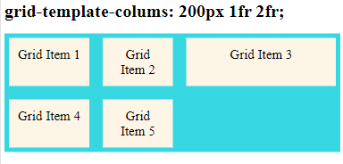
The fr unit
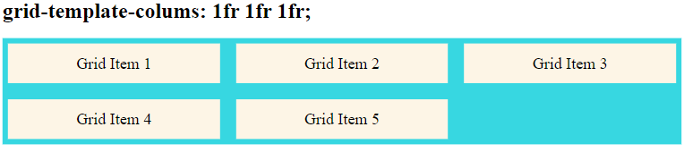
CSS Grid Layout introduced a new unit of length called fr, which is short for “fraction”. This unit represents a fraction of the available space in the grid container.
grid-template-columns: 1fr 1fr 1fr; means that the grid items will be arranged in three columns which all cover the same proportion of available space in the grid container.
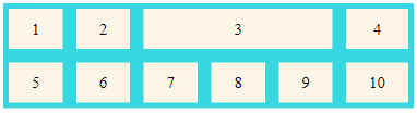
grid-template-rows Property
This property define the height of each row with values of a space-separated-list, where each value defines the height of the respective row.
.grid-container{
	display: grid;
	height: 400px;
	grid-template-columns: 1fr 1fr 1fr;
	grid-template-rows: 100px 250px 200px;
	grid-gap: 10px;
	background-color: #37D7E1;
}
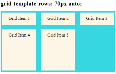
A value of auto means the size of the rows is determined by the size of the container, and on the size of the content of the items in the row.
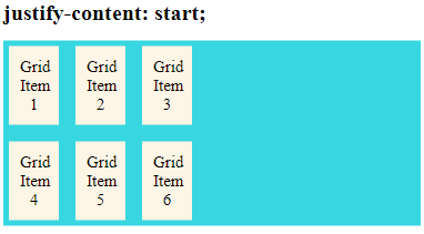
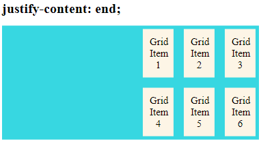
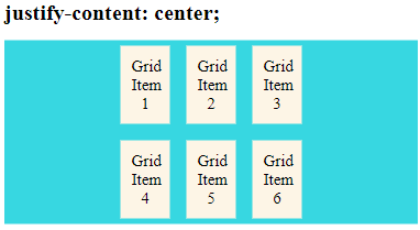
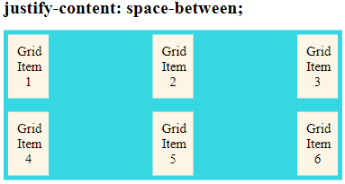
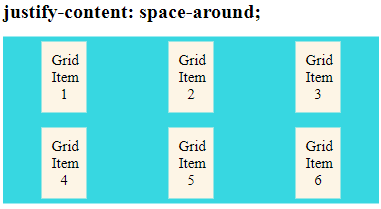
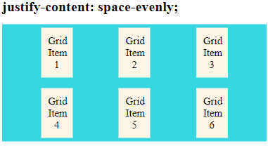
justify-content Property
Used to align the whole grid inside the container.
Note: The grid’s total width has to be less than the container’s width for the justify-content property to have any effect.
This property can take on various values depending on how you want to arrange the grid items inside the container. These values are;
start– places the grid at start edge of the grid containerend– places the grid at the end edge of the grid containercenter– the grid is placed in the center of the grid containerstretch– resizes the grid items to allow the grid to fill the full width of the grid containerspace-around– places an even amount of space between each grid item, with half-sized spaces on the far endsspace-between– places an even amount of space between each grid item, with no space at the far endsspace-evenly– places an even amount of space between each grid item, including the far ends
.grid-container {
  justify-content: start | end | center | stretch | space-around | space-between | space-evenly;
}
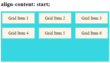
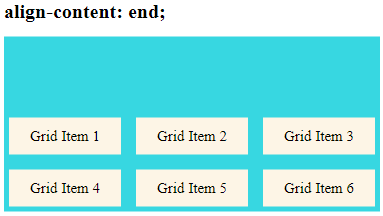
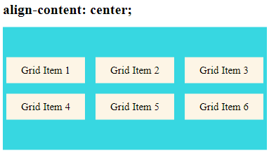
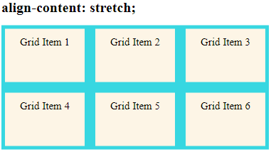
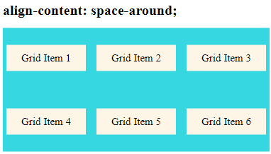
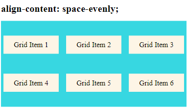
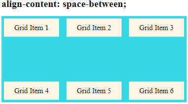
align-content Property
Used to vertically align grid items inside the grid container as opposed to justify-items which aligns grid items horizontally. This could happen if all of your grid items are sized with non-flexible units like px.
Note: The grid items’ total height has to be less than the container’s height for the align-content property to have any effect.
In the example below, I have specified the height of the grid container as 350px
.grid-container{
	display: grid;
	height: 350px;
	grid-template-columns: auto auto auto;
	align-content: space-between;
	grid-gap: 10px;
	background-color: #37D7E1;
}
The align-content property can take on values of:
start– places grid items at the start of the top edge of the grid containerend– places grid items at the bottom edge of the grid containercenter– vertically aligns grid items in the center of the grid containerstretch– resizes the grid items to allow the grid to fill the full height of the grid containerspace-around– places an even amount of space between each grid item, with half-sized spaces on the far endsspace-between– places an even amount of space between each grid item, with no space at the far endsspace-evenly– places an even amount of space between each grid item, including the far ends
.grid-container {
  align-content: start | end | center | stretch | space-around | space-between | space-evenly;
}
CSS Properties for the Grid Items
grid-column Property
Note: The grid-column property is a shorthand property for the grid-column-start and the grid-column-end properties and defines the columns where the grid item starts and ends
This property takes on values of column line numbers, or uses the keyword “span” to define how many columns the item will span for example;
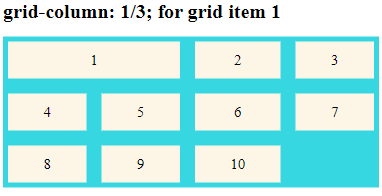
.item1{
	grid-column: 1 / 3;
}
grid-column: 1/3; means grid item1 will start on column 1 and end before column 3:
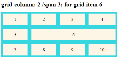
.item6{
	grid-column: 2 / span 3;
}
grid-column: 2 / span 3; means grid item 6 will start on column line 2 and span 3 columns
Output
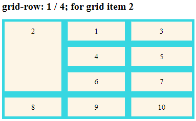
grid-row Property
The grid-row property is a shorthand property for the grid-row-start and the grid-row-end properties and defines the rows where the grid item will start and end.
This property takes on values of row line numbers, or uses the keyword “span” to define how many rows the grid item will span.
If the grid-column property is not defined before the grid-row property, the grid item will always start from column line 1.
For better placement of grid items both the grid-column and grid-row properties have to be defined as illustrated below.
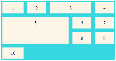
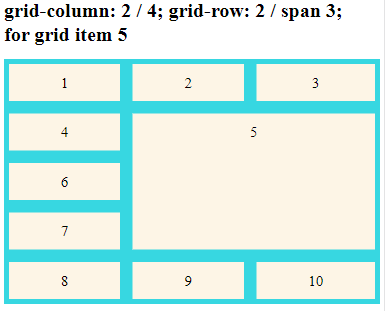
.item5{
	grid-column: 2 / 4;
	grid-row: 2 / span 3;
}
item5 starts on column-line 2 and ends on column-line 4 and also starts on row-line 2 and spans 3 more row-lines up to row-line 5
grid-area property
This is a shorthand property for the grid-row-start, grid-column-start, grid-row-end and the grid-column-end properties. Instead of writing each of these properties separately, using one property to give the values of all of these properties saves time and makes our code cleaner.
Syntax for the grid-area property
grid-area: row line where grid item starts /
column line where grid item starts /
row line where grid item ends /
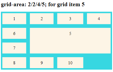
column line where grid item ends;For example the code below can be used to have “item5” start on row-line 2 and column-line 2, and end on row-line 4 and column line 5:
.item5{
grid-area: 2 / 2 / 4 / 5;
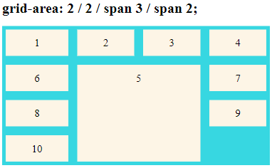
}We can even have “item5” start on row-line 2 and column-line 2, and span 3 rows and 2 columns using the code below
.item5{
	grid-area: 2 / 2 / span 3 / span 2;
}
The output of the above pieces of code will be as shown below;
Ordering grid items using grid-area property
The grid-area property allows us to position items anywhere within the grid container by specifying the row and column lines where a given grid item starts and ends. For example the HTML code below is for a grid container with six grid items.
<h1> Ordering items using grid-area</h1>
    <div class="grid-container">
    	<div class="grid-item item1">Grid Item 1</div>
    	<div class="grid-item item2">Grid Item 2</div>
    	<div class="grid-item item3">Grid Item 3</div>
    	<div class="grid-item item4">Grid Item 4</div>
    	<div class="grid-item item5">Grid Item 5</div>
    	<div class="grid-item item6">Grid Item 6</div>
    </div>
CSS code
The order of grid items can be rearranged using grid-area property as shown below.
.item1 { grid-area: 1 / 3 / 2 / 4; }
.item2 { grid-area: 2 / 3 / 3 / 4; }
.item3 { grid-area: 1 / 1 / 2 / 2; }
.item4 { grid-area: 1 / 2 / 2 / 3; }
.item5 { grid-area: 2 / 1 / 3 / 2; }
.item6 { grid-area: 2 / 2 / 3 / 3; }
Output
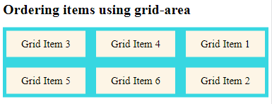
Re-arranging the order for grid items is very important when creating layouts to fit various screen sizes using media queries.
grid-template-areas properties
The grid-area property can also be used to assign names to grid items. For example grid item1 can be assigned a name of “gridAread” using the grid-area property as shown below;
.item1 {
  grid-area: gridArea;
}
Then the named grid item can be referred to by the grid-template-areas property of the grid container.
.grid-container {
  grid-template-areas: 'gridArea gridArea gridArea gridArea gridArea';
}
This means that item1 will span 5 columns
Each row is defined by apostrophes (‘ ‘) and columns in each row are defined inside the apostrophes, separated by a space. A period sign represents a grid item with no name.
The examples below shows how the grid-area and grid-template-areas properties can be used to place items in the grid container.
.item3{
	grid-area: gridItem3;
}
.grid-container{
	display: grid;
	grid-template-areas: '. . gridItem3 gridItem3 gridItem3 .';
	grid-gap: 5px;
	background-color: #37D7E1;
}
item3 will span three columns in a six columns grid layout. Other columns with unnamed grid items are represented by period signs.
In case you want to define more than one row, you have to use different sets apostrophes to define the columns of each row as demonstrated in the example below where I have show how grid items 3 and 5 are placed spanning various rows and columns.
.item3{
	grid-area: gridItem3;
}
.item5{
	grid-area: gridItem5;
}
.grid-container{
	display: grid;
	grid-template-areas: '. . gridItem3 gridItem3 gridItem3 .'
	                    'gridItem5 gridItem5 gridItem5 gridItem5 . .'
	                    'gridItem5 gridItem5 gridItem5 gridItem5 . .';
	grid-gap: 5px;
	background-color: #37D7E1;
}