Responsive Sticky Navigation Bar using HTML and CSS.
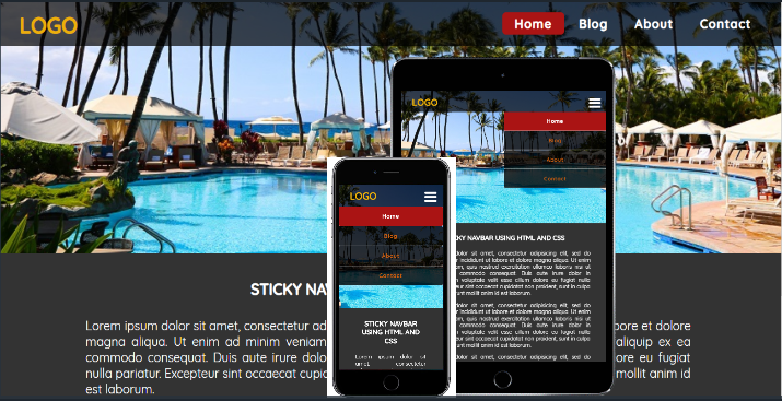
A sticky navigation bar stays at the top of the page when you scroll other content on the page. This is important because it enables users to easily move to other sections of the website using menu items without always scrolling back up.
I will now show you how to make a simple responsive sticky navigation bar using HTML and CSS only.
Before proceeding, you can check out my other tutorial on the difference between position: fixed and position:sticky to better understand the main CSS property that is used for creating a sticky navbar.
<!DOCTYPE html>
<html>
<head>
	<title>Sticky Navbar</title>
	<meta name="viewport" content="width=device-width, initial-scale=1">
	<link href="style.css" rel="stylesheet" type="text/css" >
    <link href="https://fonts.googleapis.com/css?family=Quicksand:400,500" rel="stylesheet">
	<link href="https://stackpath.bootstrapcdn.com/font-awesome/4.7.0/css/font-awesome.min.css" rel="stylesheet">
</head>
<body>
   <div id="navbar">
    	<input type="checkbox" id="nav-toggle">
    	<label for="nav-toggle"><i class="fa fa-bars fa-2x"></i></label>
    	<div class="logo"><a href="#">LOGO</a></div>
    		<div class="menu">
    			<a class="active" href="#">Home</a>
    			<a href="#">Blog</a>
    			<a href="#">About</a>
    			<a href="#">Contact</a>
    		</div>
    </div>
    <div class="menu-img"></div>
    <div class="mytext">
    	<h2>STICKY NAVBAR USING HTML AND CSS</h2>
    	<p>Lorem ipsum dolor sit amet, consectetur adipisicing elit, sed do eiusmod
    	tempor incididunt ut labore et dolore magna aliqua. Ut enim ad minim veniam,
    	quis nostrud exercitation ullamco laboris nisi ut aliquip ex ea commodo
    	consequat. Duis aute irure dolor in reprehenderit in voluptate velit esse
    	cillum dolore eu fugiat nulla pariatur. Excepteur sint occaecat cupidatat non
    	proident, sunt in culpa qui officia deserunt mollit anim id est laborum.</p>
        <p>Lorem ipsum dolor sit amet, consectetur adipisicing elit, sed do eiusmod
        tempor incididunt ut labore et dolore magna aliqua. Ut enim ad minim veniam,
        quis nostrud exercitation ullamco laboris nisi ut aliquip ex ea commodo
        consequat. Duis aute irure dolor in reprehenderit in voluptate velit esse
        cillum dolore eu fugiat nulla pariatur. Excepteur sint occaecat cupidatat non
        proident, sunt in culpa qui officia deserunt mollit anim id est laborum.</p>
    </div>
</body>
</html>
For the CSS, we give the navbar a position: sticky and then specify the location where to make it sticky. Since I want it to stick to the top of the webpage, I’ll use top: 0; as the offset point.
body {
	margin: 0;
	padding: 0;
	background:rgba(0,0,0,0.8);
	font-family: Quicksand;
}
#navbar {
	width: 100%;
     text-align: right;
	height: 70px;
	line-height: 70px;
	background: rgba(0,0,0,0.7);
	border-bottom: rgba(255,255,255,0.3);
	position: sticky;
	top: 0;
}
.logo a{
    text-decoration: none;
	float: left;
	margin-left: 40px;
	margin-top: 2px;
	color: #ebaf09;
	font-size: 35px;
	font-weight: bold;
}

.menu {
    margin-right: 30px;
}
.menu a {
    text-decoration: none;
	text-align: center;
	padding:  5px 20px;
	line-height: 70px;
	font-size: 20px;
	letter-spacing: 1.5px;
	font-weight: bold;
	color: #fff;
	border-radius: 6px;
}

label {
	margin-right: 40px;
	font-size: 25px;
	line-height: 70px;
	margin-top: 10px;
	padding: 0 10px;
	float: right;
	width: 25px;
	display:none;
}
label i{
	position: relative;
	margin-left: 10px;
	color: #fff;
}
#nav-toggle{
	display: none;
}
.menu-img {
	width: 100%;
	height: 100vh;
	background: url(image to use as background);
	background-size: cover;
	background-position: center;
}
.mytext {
	margin-top: 40px;
	padding: 0 150px;
	box-sizing: border-box;
	height: auto;
	text-align: justify;
	color: #fff;
}
.mytext h2 {
	font-size: 25px;
	margin: 0;
	padding: 0 0 10px;
	text-align: center;
}
.mytext p {
	font-size: 20px;
}
.menu a.active{
	background-color: #aa1414;
	color: #fff;
}
.menu a:hover:not(.active){
	background-color: #747474;
	color: #fff;
}

@media only screen and (max-width: 800px){
	#navbar{
		padding-top: 10px;
	}
	.logo{
	 	position: absolute;
	 	top:5px;

		font-size: 20px;
	}
	label{
		display: block;
        cursor: pointer;
	}
	.menu{
		position: absolute;
		width: 50%;
		margin-left: 50%;
	    text-align: center;
	    top: 80px;
	    display: none;
    }

    .menu a{
	display: block;
	padding: 0;
	margin: 0;
	color:#c75b0e;
	background-color: rgba(0,0,0,0.8);
	border-bottom: 1.5px solid #c6c6c4;
    }
	#nav-toggle:checked ~ .menu {
		display: block;
	}
	.menu-img{
	width: 100%;
	height: 70vh;
    }
    .mytext {
	padding: 0 60px;
    }
}

@media only screen and (max-width: 500px) {
	.menu{
		width: 100%;
		margin:0;
    }
}
A sticky navbar has position of relative by default but as you scroll the page, it will stick at the specified location when it reaches there but for the above example you will not see the navbar scrolling up because it is already positioned at the very top of the page.
I have also included some media queries to cater for mobile devices where I have used the general sibling selector “~” to toggle the display of menu items when the bar icons are pressed depending on state of the <input> element having the “checkbox” value in its type attribute.