How to Create HTML Forms.
Forms are very important in web development because they enable website users to sign up, login and perform other interactive activities like commenting, sending emails, giving feedback and filling up surveys on a web page.
The data collected using forms is handled in the backend by a Common Gateway Interface (CGI) involving manipulation of information in databases. However, for this tutorial I’ll mainly deal with the front-end aspect of forms.
HTML Form element.
The form element is made up of <form>…</form> tags and is used to enclose other elements used for creating a form.
It is possible to have more than one set of form tags on a web page, but each one will be submitted separately from each other.
Attributes for the <form> tag:
action – specifies where the data entered into the form will be forwarded after being submitted. This attribute takes the value of the URL of file that the data entered into the form will be passed to.
method – specifies the HTTP method to use when sending form-data which can be either GET or POST method.
- GET – The data is submitted and encoded into the URL of the resulting web page hence the result of your submission is visible in the browser’s URL location bar.
- POST – This method submits the data “behind the scenes” via standard input and the data is not displayed in the browser’s URL location bar.
name / id – for assigning an identifier name to the form. Newer browsers support the preferred “id” attribute, but the “name” attribute is still needed with a few older browsers.
target – This specifies which browser window the resultant information will be displayed for example if you use a value of “_blank” the response that is received after submitting the form will be opened in a new browser window.
accept – This is only used when you have an <input> tag with a “file” attribute. It restricts the type of files uploaded to the server when the form is submitted. The values for this attribute should be one or more MIME types. For example: accept=”text/html, image/gif” would only allow an HTML file or a GIF file to be uploaded.
enctype – This is only relevant when the method attribute is “POST” and specifies how the form-data should be encoded when submitting it to the server. The default is “application/x-www-form-urlencoded” and you will rarely need to change it. However, if you are uploading files via your form, you should set this to “multipart/form-data”.
Other HTML elements within the Form tags.
The <label> element
Is used to specify a label for an <input> element of a form and adds a label to a form control such as text, email, password, textarea and others. It toggles the control when a user clicks on a text within the <label> element.
This element has the following attributes:
for – It refers to the input control that this label is for. Its value must be the same as the value of the input control’s “id” attribute.
form – It refers to the form to which the label belongs to.
The <input> element
This element does not have an ending tag and is the most common tag that is placed within a form element. An <input> tag is used to create areas within the form where a user can enter text, click buttons and make selections. This tag will display and act differently on the browser’s window depending upon the value of the “type” attribute as explained below.
Attributes of the <input> tag:
name / id – creates an identifier for the input tag. The name attribute is required since it is used for the backend processes of the form. The id attribute is a unique identifier used for styling using CSS.
type-This tells the browser which type of input should be rendered to the browser’s screen. The default is “text” and other common input types include;
- button – This creates a clickable button and can be used instead of the “reset” or “submit” values to create a unique button.
- checkbox – This creates a small box with two states: off/not checked and on/checked. Each checkbox is meant to be independent from each other, unlike the “radio” button below.
- radio – This creates a small circle on/off button. It is similar to the “checkbox” value, but it is meant to be used in a related group of items of which only one can be selected. When you give multiple radio buttons the same “name” attribute, then only one of the buttons will be able to be selected at a time.
- file – This creates a button and an associated text field that lets the user select the location of a file on his or her computer to upload to the server. If the button is clicked, a “file dialog box” will open allowing the user to find the path and file.
- hidden – This creates an invisible field that is not shown on the browser’s window. You can use this to carry over data from one form to another, or to automatically submit data with a form (the current date for example).
- image – This creates a graphical button. You can use this to replace the “button”, “reset” or “submit” values if you wish to create your own look and feel for your form. If the “image” value is used for the <input> tag’s type, then you can also include other attributes that are associated with images such as src, width, height, alt, border, and so on within the <input> tag.
- password – This creates a text field identical to the “text” value except that any character typed into the field is represented a bullets or asterisks. This ensures that you can protect a person’s password from being viewed on a computer screen.
- reset – This creates a button that reverts the form fields back to their original condition.
- submit – This creates a button that submits the form to the CGI application when it is clicked.
- The input type can also be time, URL, week, date, search, month, number, datetime-local, email, color, tel and range(slider).
placeholder – specifies a short hint that describes the expected value of an input field and this is displayed in the input field before the user enters a value. This attribute works with text, search, url, tel, email and password input types.
accept – This is identical to the “accept” for the <form> tag as shown above.
maxlength – This restricts the maximum number of characters that may be typed into a text field.
size – This changes the width of a text element. The default is 20 characters.
value – This assigns a value to the <input> tag. If the tag is a text box, the value will appear in the text field. With a radio or checkbox, the value attribute is required because it is associated with that tag when the form is submitted. For button, submit and reset <input> tags, the value attribute alters the text shown in the button.
checked – This is only used if the “type” attribute is set to “checkbox” or “radio” and no value is associated with this attribute. For example: <input type=”checkbox” checked> This forces the checkbox to be checked or “on”. The default is that the checkbox or radio button is turned off.
Example: <input name=”pass” maxlength=”10″ size=”10″ type=”password”> This creates a password text box with a size or length of 10 characters and only 10 characters can be entered.
The <textarea> element.
This is used to create a suggestion or comments box by availing multiple lines for a user to input text.
Attributes for the <textarea> tag:
cols – determines the width of the textbox in number of characters. The default depends on the browser and operating system of the computer being used.
name – This is a required attribute that is associated with the submitted data entered in the text area.
rows – determines the height in number of lines of text that can be displayed without scrolling. The default depends on the browser and operating system of the computer being used.
The illustration below shows how the html <textarea> tag is used.
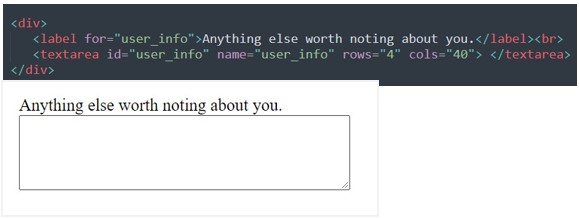
The tag will create a text area that is 40 characters in width and 4 lines in height.
There is nothing between the beginning and ending tags. In case you would like to have some default text then you can place that text between the starting and ending tags.
The <select> element.
This allows us to display either a pulldown menu or a scrolling list that a user can choose from. For the select tag to be usable, there must be one or more <option> tags within it to determine what to choose within the select tag.
Attributes for the <select> tag:
multiple – This tells the browser how many elements within the select tag can be chosen at the same time. There is no value associated with this attribute. The default is one element if the multiple attribute is not included in the <select> tag. If the multiple attribute is included, then the user can select multiple elements from the list box. This attribute only make sense if used with a size attribute of 2 or more.
name – This is a required field that is submitted in association with the data that is submitted by this tag.
size – This determines how the <select> tag is shown on the browser. The default is 1. If not used or if given a value of 1, then the tag is shown as a pulldown menu. If size is used and given a value of 2 or more, then the tag is shown as a list box. The value of the size attribute determines how many lines of height the list box will have.
Example: <select name=”color” size=”5″ multiple> This tag will create a list box showing five elements and will allow the user to choose more than one element in the list.
The <option> element
This defines what will appear within the <select> element. The option tags must be within the select tags to work correctly. You need to create one option tag for each element within the select tag.
Attributes for the <option> tag:
selected – This attribute pre-selects an element within the select tag. The default is the topmost element within the select tag. With this attribute, you can set pulldown or list box to automatically select any of the elements. If the “multiple” attribute is set in the select tag, you can have more than one option with this attribute. There is no value associated with this attribute.
value – This associates a value with the specific option. The default is whatever text is within the option tag’s starting and ending tags. This is the value that will be sent with the select tag’s name value when the form is submitted.
The example below is a demonstration of how the <select> and <option> tags are used to display items in a dropdown menu on a webpage. I’ll use a list of countries for my dropdown list.
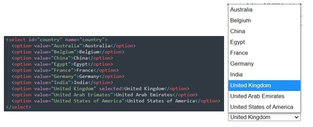
United Kingdom will be the default country to appear on the list because of the selected attribute added to its option tag.
Registration Form using HTML.
After learning the fundamental tags and attributes needed to create forms in html, I’ll now combine that knowledge and design a registration form using HTML only. The code for the form is given below.
<!DOCTYPE html>
<html>
<head>
<meta charset="UTF-8">
<meta name="viewport" content="width=device-width, initial-scale=1.0">
<title>Sample Form</title>
</head>
<body>
<h1>Registration Form</h1>
<form action="" method="post">
<div>
<label for="fname">First Name:</label>
<input type="text" name="fname" id="fname">
<label for="lname" >Last Name:</label>
<input type="text" name="lname" id="lname">
</div> <br>
<div>
<label for="dob">Date of birth:</label>
<input type="date" name="dob" id="dob">
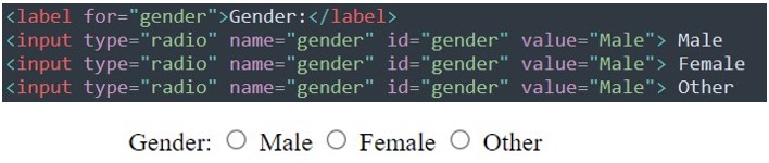
<label for="gender">Gender:</label>
<input type="radio" name="gender" id="gender" value="Male"> Male
<input type="radio" name="gender" id="gender" value="Male"> Female
<input type="radio" name="gender" id="gender" value="Male"> Other
</div> <br>
<div>
<label for="user_phone">Phone:</label>
<input type="tel" name="user_phone" id="user_phone">
<label for="user_email" >Email:</label>
<input type="email" name="user_email" id="user_email">
</div> <br>
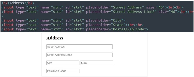
<h2>Address</h2>
<input type="text" name="strt" id="strt" placeholder="Street Address" size="46"><br><br>
<input type="text" name="strt" id="strt" placeholder="Street Address Line2" size="46"><br><br>
<input type="text" name="strt" id="strt" placeholder="City">
<input type="text" name="strt" id="strt" placeholder="State"><br><br>
<input type="text" name="strt" id="strt" placeholder="Postal/Zip Code">
<select id="country" name="country">
<option value="Australia">Australia</option>
<option value="Belgium">Belgium</option>
<option value="China">China</option>
<option value="Egypt">Egypt</option>
<option value="France">France</option>
<option value="Germany">Germany</option>
<option value="India">India</option>
<option value="United Kingdom" selected>United Kingdom</option>
<option value="United Arab Erimates">United Arab Emirates</option>
<option value="United States of America">United States of America</option>
</select>
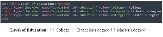
<p><strong>Level of Education:</strong>
<input type="checkbox" name="education" id="education" value="college"> College
<input type="checkbox" name="education" id="education" value="bsdegree"> Bachelor's degree
<input type="checkbox" name="education" id="education" value="mstdegree"> Master's degree
</p>
<div>
<label for="user_info">Anything else worth noting about you.</label><br>
<textarea id="user_info" name="user_info" rows="4" cols="40"> </textarea>
</div>
<br><div>
<label for="pword">Password:</label>
<input type="password" name="pword" id="pword">
<label for="cpword">Confirm Password:</label>
<input type="password" name="cpword" id="cpword">
</div> <br>
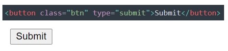
<button class="btn" type="submit">Submit</button>
</form>
</body>
</html>When this HTML code file above is openned in a browser the form below will be observed.
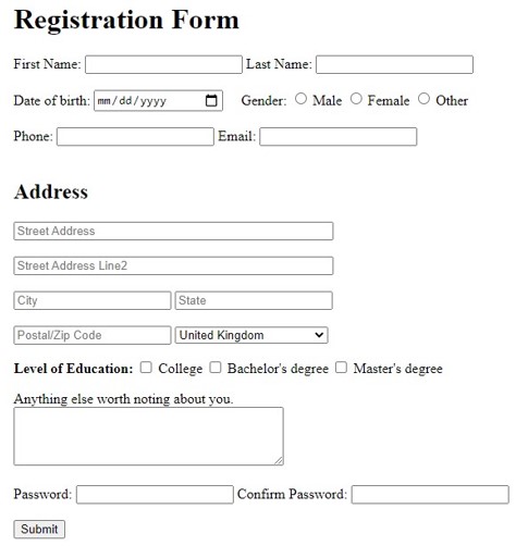
This form is made entirely using HTML. We can make the form more visually appealing by applying different styling using CSS. However for now, our major goal was to understand the building blocks of various types of forms and that is done using the HTML form tag,