How to use CSS Media Queries for Responsive web design.
When developing and designing websites today you have to keep in mind the various devices that people use to access the website for example desktop computers, tablets and mobile phones.
This is the basis of Responsive web design which enables content to be accessed for the different types of devices but in each case the content is arranged differently depending on the device screen and functionality.
Media Query is a design technique which was introduced in CSS3 and enables developers to apply a number of breakpoints where parts of the website behave differently on the various devices.
What is a Media Query?
A Media query is a CSS3 feature that makes a webpage adapt its layout to different screen sizes and media types.
Syntax for a media query
@media media type and (condition: breakpoint) {

   CSS rules...

}
The media query simply targets different media types with a variety of conditions for a given breakpoint. If the conditions are satisfied, then the CSS rules inside the media query will be applied, otherwise, they won’t.
A media query is made up of the following parts;
@ media Rule: This is the starting point of a media query and specifies the media type that is being targeted.
media type: media queries apply to the following media types;
condition: this specifies the media features that the query is affecting at a given break point. These can include; width, height, color, orientation, scan, resolution and many more.
CSS Media Queries breakpoints:
Due to the vast number of devices on the market with different width and height, there are no standard break points for each device. However, the following categories are currently being used by many website designers;
| Device | Resolution | Example CSS query |
|---|---|---|
| Extra small devices (phones below 600px) | 320px – 480px | @media only screen and (max-width: 480px){…} |
| Small devices (Portrait tablets and large phones) | 481px – 768px | @media only screen and (min-width: 480px){…} |
| Medium devices (Landscape tablets) | 769px – 1024px | @media only screen and (min-width: 768px){…} |
| Large devices(laptops, desktop computers) | 1025px – 1200px | @media only screen and (min-width: 992px){…} |
| Extralarge devices(Large laptops and desktop computers, TVs) | 1201px and above | @media only screen and (min-width: 1200px){…} |
Media query keywords:
not: The “not” keyword inverts the meaning of an entire media query.
Only: The “only” keyword prevents older browsers that do not support media queries with media features from applying the specified styles. It has no effect on modern browsers.
And: The “and” keyword combines a media feature with a media type or other media features.
These keywords are all optional. However, if you use not or only, you must also specify a media type.
Example;
@media only screen and (max-width: 480px) {

  .text {

    font-size: 16px;

  }

}
If the browser window is 480px or smaller, the text size will be 14px.
Application of media queries.
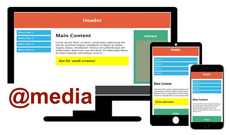
CSS media queries are used to make a webpage adapt its layout to different screen sizes and media types. In the example below I demonstrate how to use media queries to change the layout of the webpage, to hide some elements and change font size.
HTML script for the website
<!DOCTYPE html>
<html>
<head>
<meta name="viewport" content="width=device-width, initial-scale=1.0">
<link href="style.css" rel="stylesheet" type="text/css" >
</head>
<body>
<div class="header">
  <h1>Header</h1>
</div>
<div class="container">
  <div class="col-3 menu">
    <ul>
    <li>Menu Item 1</li>
    <li>Menu Item 2</li>
    <li>Menu Item 3</li>
    <li>Menu Item 4</li>
    </ul>
  </div>
  <div class="col-6">
    <h1>Main Content</h1>
    <p> Lorem ipsum dolor sit amet, consectetur adipiscing elit, sed do eiusmod tempor incididunt ut labore et dolore magna aliqua. Vestibulum rhoncus est pellentesque elit ullamcorper dignissim cras tincidunt. Et malesuada fames ac turpis egestas sed tempus urna et.</p>
    <div class="hidden">Not for small screens!</div>
  </div>
  <div class="col-3">
    <div class="sidebar">
      <h2>Sidebar</h2>
      <div class="ad-space"></div>
    </div>
  </div>
</div>
<div class="footer">
  <p>FOOTER</p>
</div>
</body>
</html>
CSS script for the website
* {
  box-sizing: border-box;
}
.container::after {   /*clearfix hack*/
  content: "";
  clear: both;
  display: block;
}
[class*="col-"] {
  float: left;
  padding: 15px;
}
html {
  font-family: "Lucida Sans", sans-serif;
}
.header {
  background-color: #E65D3E;
  color: #ffffff;
  padding: 15px;
  text-align: center;
}
.menu ul {
  list-style-type: none;
  margin: 0;
  padding: 0;
}
.menu li {
  padding: 8px;
  margin-bottom: 7px;
  background-color: #33b5e5;
  color: #ffffff;
  box-shadow: 0 1px 3px rgba(0,0,0,0.12), 0 1px 2px rgba(0,0,0,0.24);
}
.menu li:hover {
  background-color: #0099cc;
}
.sidebar {
  background-color: #42AE80;
  padding: 15px;
  color: #ffffff;
  text-align: center;
  font-size: 14px;
  box-shadow: 0 1px 3px rgba(0,0,0,0.12), 0 1px 2px rgba(0,0,0,0.24);
}
div.hidden {
  background-color: yellow;
  padding: 20px;
  font-size: 20px;
  font-weight: bold;
}
.ad-space{
  background-color: #919E80;
  height: 300px;
  width: 100%;
  padding: 15px;
}
.footer {
  background-color: #3F4241;
  color: #ffffff;
  text-align: center;
  font-size: 12px;
  padding: 15px;
}
/* For desktop: */
.col-3 {width: 25%;}
.col-6 {width: 50%;}
@media only screen and (max-width: 768px) {
  /* For mobile phones: */
  [class*="col-"] {
    width: 100%;
  }
}
@media screen and (max-width: 600px) {
  div.hidden {
    display: none;
  }
}
/* If the screen size is 600px or less, set the font-size of  to 30px */
@media only screen and (max-width: 600px) {
  div.hidden {
    font-size: 30px;
  }
}


In this example we have used floating elements for responsive web design. However modern CSS layout techniques such as flexbox and grid layout make the creation of these responsive layouts easier.


The media queries used in the above example include;


1. Changing the layout of the webpage by varying the width of the elements.

For desktop computers we use col-3 with 25% width and col-6 with 50% width. For mobile devices all the col- elements will have 100% width and this is achieved using the media query below;


@media only screen and (max-width: 768px) {

  /* For mobile phones: */

  [class*="col-"] {

    width: 100%;

  }

}


2. Hiding some content on the page
 for example the media query below is used to hide the contents of the element with the class hidden.From the website this is the part with the yellow background and the phrase “Not for small screens!”


@media screen and (max-width: 600px) {

  div.hidden {

    display: none;

  }

}


3. Changing size of text.
The size of the phrase “Not for small screens!” is changed to 30px for screens 600px or less using the media query below.


@media only screen and (max-width: 600px) {

  div.hidden {

    font-size: 30px;

  }

}


Importance of the viewport meta tag attribute


Web pages should include a meta viewport tag in the head of the HTML file if they are intended to be accessed from a variety of devices. This determines how the browser outputs the page’s dimensions and scaling especially for small screen devices.


From the HTML code in the above example, you can observe the following element included in the head of the file;


<meta name=”viewport” content=”width=device-width,initial-scale=1”>


The meta viewport value width=device-width allows the page to rearrange content to match different screen sizes, whether rendered on a small mobile phone or a large desktop monitor.


If the viewport meta tag is not included in the head of the HTML file, media queries will not be rendered as expected.